Box scores... Fire away.

Chicken - 8
Does look a little crowded

Ribs - 8

Pork - 7
Looks tasty, but is very overcrowded.

Brisket - 7
Again looks tasty, but looks too crowded

More doesn't always translate into better. As a CBJ I like to see a full box that is neat and tidy.
 
Chicken - I like the color, but don't care for the gritty finish....7

Ribs - A home run.....9

Pork - The family has outgrown the trailer, too much going on there.....7

Brisket - Great color, but strain the jus for a 9.....8
 
In my honest opinion, you need to work on your presentation. For instance, your putting greens could be neater. Your arrangements should be symmetrical, with all the pieces looking almost identical to each other and spaced perfectly. I don't love diagonal presentations, but that's a personal preference. The sauce should be neatly applied and should shine. The box should be as full as possible, but should show a border of the parsley and the border should be neat and tight and even. Each box should look like it's ready for a magazine cover and make you just HAVE to eat it.

You're asking for opinions, and opinions are subjective, but here are mine. I am a KCBS Certified Judge, and here's how I would score it and why:

The color of the chicken is dark and the skin on some of the pieces looks thick. The thighs are too small for my taste, maybe six bigger thighs would look better? The skin is shrunk back on some pieces and not on others. I don't love the shape of the pieces.
Appearance: 7

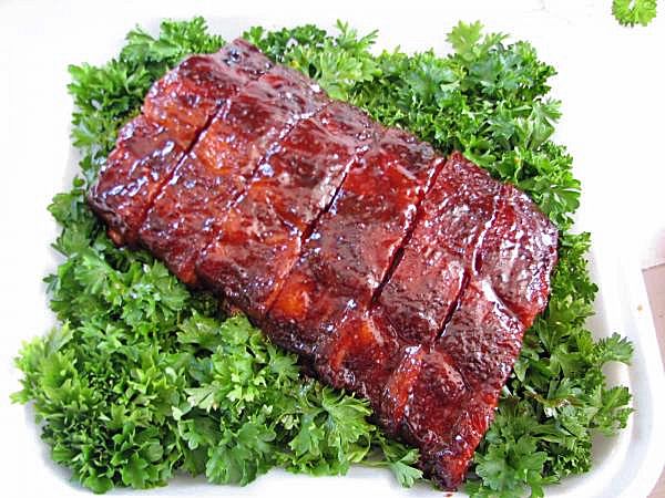
The ribs look good, with good color, but I think you're showing too much green and the green that shows is not tight and neat. The ribs are not all the same size and shape, but they all neatly cut and appear to come off the same rack.
Appearance: 8

The pork overfills the box, the arrangement is too random and the spacing on the slices is not perfiect. The parsley just pokes out here and there and is almost completely hidden. The sauce on the front piece is a little sloppy.
Appearance: 7

The spacing on your brisket slices is uneven and the edges don't line up perfectly. The front piece looks like it has a seam or fat line in it? The parsley is not neat and tight. I know you said you evened out the sauce, but I can only judge the picture.
Appearance: 7

With good scores in taste and tenderness, you could still do very well in a comp with these entries, but a little more effort in the presentation will improve your chances. Good luck!
 
Like Ron_L said, pictures you have more time to study and be critical, in a 10 second glance things have to jump out at you.

Chicken 8-9 I like the look, and how the chicken is prominent in the box, the lower right piece doesn't look as glazed as the others, may be just the pic.

Ribs 7-8 I don't care for the angle on these, the ribs look great good color, but it makes it hard to view, in my opinion.

Pork 7 The huge slices through the center draw the eye, even tho I usually like a full box, this is a little much. Hard to look at the chunks when all you see is the slices.

Brisket 8 It does look like there are grill marks on part of the right side of the first slice, color is good, they look like I would eat them.
 
Chicken, 9 I love that presentation it would make it stand out & it makes me want to eat it. Great color.
Ribs -8 I think the green is actually distracting. Its a bit of a mess with the different heights.
Pork-7 its really splotchy and there is so much going on I don't know where to look.
Brisket-9 (I am going to edit this and say I just want to eat them)
 
Last edited:
I didn't look at the other replies, and glanced at each pic for no more than 5 seconds.

8 - Chicken looks chocolaty but I like the layout.
9 - Ribs look great.
9 - Pork looks great, despite no pulled. :wink:
8 - Brisket looks great, would have been a 9 if not for the fat layer still in there.
 
Pictures can be so deceiving, even the slighest angle can throw off the color...... based on that:

Chicken - Weak 8 - I think it's too dark. The arrangement is a plus, and keeps it an 8 for me.

Ribs - Strong 8 - They might look like a 9 in person as there is some glare there. The parsley bed could be tighter.

Pork - Weak 8 - The box ix crowded and I don't like the fat.

Brisket - Middle-of-the-road 8 - I like the burnt ends and the moistness of the slices. I would have liked to have seen the improved arrangement of the slices.
 
im loving this feedback.. very helpful.... this chit should be on the back of our judging slips. !

Keep it coming.. I just deleted a post with the scores for fear it would stop the thread.

heres some answers..

yes it was troy and i would have taken another picture after we cleaned up the brisket if my team wasnt screaming at me to GO GO GO GO! Scott sounded like George Michael.. :) Wake me UP before u go go..
 
PhilBrisket7-20-10.jpg


I knocked some of the glare off the photo, and sharpened it a hair.... now they look like a solid 9.

Here is the original.

picture.php
 
the chicken layout disturbs me. Reminds me of a 3-D stererogram. You know, one of the pictures of a colorful design that when staring at long enough another image appears
 
I don't even compete and can not give any score because I'm even less of a judge but...VISUALLY the rib presentation is outstanding. The chicken and pork boxes look too busy. I do like the brisket but not as much as the rib box. I'd not hesitate to eat any of them though!
 
Chicken - 9
Ribs - 8
Pork - 8
Brisket - 7

Ribs- add more or align so you have even green area.
pork- looks like the box is giving birth. too much.
brisket - looks a mess.
 
Back
Top