• working on DNS.. links may break temporarily.

New Plowboys Team Shirts

Plowboy

somebody shut me the fark up.
Joined
Oct 9, 2006
Messages
8,532
Reaction score
715
Points
0
Age
54
Location
Blue Springs, MO
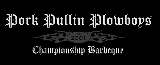
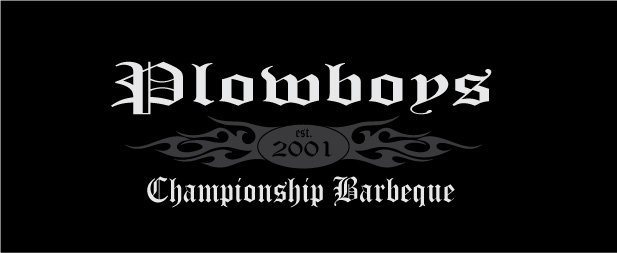
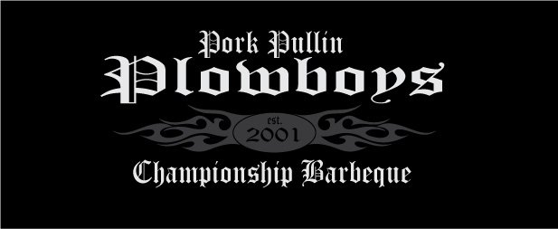
Went out today to take advantage of no sales state or county sales tax this weekend. Bought a few t-shirts and started getting some ideas. Thinking about doing this shirt for fall with a long sleeve T. Thoughts on how to improve? I'm not much of a graphics artist, but I can do a pretty good job of layout in Illustrator.
 

Attachments

  • plowboys-shirts-2008.jpg
    plowboys-shirts-2008.jpg
    32 KB · Views: 193
I think if you arc the copy, you'll be able to get the image larger on the shirt. And since you have a lot of letters in your name, that will make for better readability.
 
Kind of like this better. Good point, Bob.
 

Attachments

  • plowboys-shirts-2008-2.jpg
    plowboys-shirts-2008-2.jpg
    24.9 KB · Views: 185
Try adding Pork Pullin in a smaller pt size above "lowboy". Let's see what that looks like.
 
That's lookin' good Todd, but I still think that the old ones with the tractor are cool, too. :biggrin:
 
Try adding Pork Pullin in a smaller pt size above "lowboy". Let's see what that looks like.

Tried that in a few different ways. Looks busy.
 

Attachments

  • plowboys-shirts-2008-3.jpg
    plowboys-shirts-2008-3.jpg
    28 KB · Views: 186
It's probably the artist in me, but the ye olde English font clashes big time with the tribal armband thing goin' on in the middle (especially with the post-modern "pullin" verbiage). It's kinda like Shakespeare meets modern tribal armband tattooed freak. There are a ton of modern fonts out there that would tie the two together.

You might try this font (bottom version), or this one.

Just my $0.02,
John
 
It's probably the artist in me, but the old English font clashes with the tribal armband thing goin' on in the middle (especially with the post-modern "pullin" verbiage). It's kinda like Shakespeare meets modern tattooed freak. There are a ton of modern fonts out there that would tie the two together.

Just my $0.02,
John

Chit! Good Point.
 
Todd, I was going to say the Olde English font didn't seem to fit BBQ. Nice ideas though. Look forward to seeing the final version. I'm trying to put something together for Sloppy Creek before the Royal!
 
I actually think the Old English looks good, I like going for things that aren't always seen , it gets you noticed and remembered. I agree about the tribal band though, you could get the same type of effect if you added something like a crest to the center instead, you could even have a pig somehow in there, if that's your thing.
 
Back
Top