B
BrooklynQ
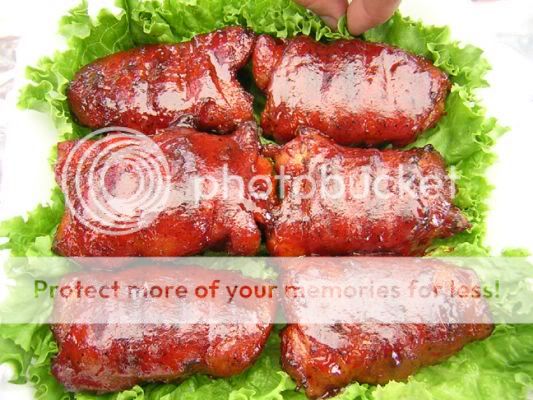
Guest
Ok folks, I have no idea what these scored, but here's some pics from the Harpoon Brewery Contest last year. What would you give them on appearance? Using KCBS Methods.... 2 - sucks, 9 outstanding.
1. Jack Daniel

2. Harpoon4
3. HarpoonWing

4.PIPchick.

This is just for fun. I Just want to see what folks think. One of these chicken dishes took first prize, but remember the appearence has the lowest weight in the final score.
1. Jack Daniel
2. Harpoon4
3. HarpoonWing
4.PIPchick.
This is just for fun. I Just want to see what folks think. One of these chicken dishes took first prize, but remember the appearence has the lowest weight in the final score.

 It is our last chance to score points and I "fuss" a lot to get them as good as possible and I hold nothing back.