First Year Team Logo

C

CAustin919

Guest
Not sure if I am putting this in the right place...

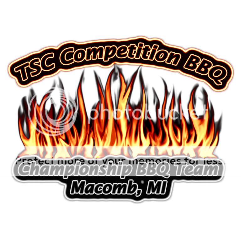
I have formed a BBQ Team this spring and we plan on "officially" competing for the first time this year. I know in the grand scheme the logo doesn't matter much, but...

Long story short, didn't want to pay for a logo cause' I think we are only going to compete a few time to get the feel for competition this year.

So here is what I came up with. No cost just, some time wasted on Photoshop.

What doth' the Brethren think?

TSCCompetitionBBQlargerflameswhiteb.jpg
 
Chris,

Great job on the logo. Good luck at the comps.
 
On behalf of another rookie-ish championship BBQ team, I think the logo looks great!:wink: Next step, banner, t-shirts, embroidered cowboy hat (for the ladies) etc etc etc.:-D
 
your logo looks great, i just bought mine and have never entered a comp yet. i am going to try to get all mt ducks in a row first.
again, looks great:smile::smile::smile::smile:
 
i realy like that logo i think is is very cool... it seems to have a diferant look i realy like it
 
Looks great.

I'm not being a turd, just making an observation.

Why do you have BBQ in your logo twice?
What does TSC stand for?

Maybe put TSC (spell it out) at the top and Competition (or Championship) BBQ Team at the bottom.
 
i realy like that logo i think is is very cool... it seems to have a diferant look i realy like it

Thanks. I really like the "cartoon" style logos, but ultimately I couldn't decide what to put in it. So I figured go simple and a little different.

Looks great.

I'm not being a turd, just making an observation.

Why do you have BBQ in your logo twice?
What does TSC stand for?

Maybe put TSC (spell it out) at the top and Competition (or Championship) BBQ Team at the bottom.

Good points.

TSC is the short for the name of my catering company. The Spice Cellar. We also make the rubs that will be used at the comps. I plan on flying a banner with both the BBQ logo and the catering information.

As far as having the BBQ twice... I went back and forth on that a hundred times. "TSC Competition BBQ" is going to be the name of the team. The bottom is more or less just a description.

Thanks for the input. :biggrin:
 
looks good, but heres a heads up. Im not sure where you got the artwork, so this may be a moot issue.

if its a quickie photoshop job, and you used some stock clipart your resolution may be too low and it will blur out when you expand it for a banner. You will need some hi-resolution graphics when you resize to a banner.
 
Thanks. I really like the "cartoon" style logos, but ultimately I couldn't decide what to put in it. So I figured go simple and a little different.


Good points.

TSC is the short for the name of my catering company. The Spice Cellar. We also make the rubs that will be used at the comps. I plan on flying a banner with both the BBQ logo and the catering information.

As far as having the BBQ twice... I went back and forth on that a hundred times. "TSC Competition BBQ" is going to be the name of the team. The bottom is more or less just a description.

Thanks for the input. :biggrin:

Yeah its a pain the rear to finalize the name of the team and tagline. We went back and forth a hundred times as well. It is almost as hard as figuring out what recipe of rub to use, the flavor of wood, sauce. Lol!
 
looks good, but heres a heads up. Im not sure where you got the artwork, so this may be a moot issue.

if its a quickie photoshop job, and you used some stock clipart your resolution may be too low and it will blur out when you expand it for a banner. You will need some hi-resolution graphics when you resize to a banner.


I was going to mention that as well. What you will have to do is either rasterize the image or create a vector illustration in order to make it look good on a 4x6 banner. In fact, most sign companies will require this if you don't want to pay them for design time. If you are as good at phtoshop as your logo suggests, however this should not be a problem.
 
looks good, but heres a heads up. Im not sure where you got the artwork, so this may be a moot issue.

if its a quickie photoshop job, and you used some stock clipart your resolution may be too low and it will blur out when you expand it for a banner. You will need some hi-resolution graphics when you resize to a banner.

Great advice.

At first I was a little worried about all of that when I decided to create the logo. But I took my time and did a little net surfing. I stopped at a couple printing sites that the Brethren have used to get a feel for the standard file type, max file size, and minimum resolutions used.

The artwork is original, I drew it all in Photoshop as I went along. It was all done at 256 dpi and saved as gif, jpg, eps, and bmp. The original image is actually 22" x 22" so if it does need to be enlarged for a banner it won't need to stretched that much.

I have first hand experience in seeing what a poorly designed logo looks like blown up. The first logo I did for my catering company a few years back, was printed without any guidance by a local print shop. It looked Lite-Brite art. :rolleyes:

Thanks again everyone, for the input. :biggrin:
 
Yeah, I used the wrong logo art for some banners we ordered from tailgate banner online store and our banners from them look like dog crap. But from a distance yards away they look OK.
 
Back
Top