You are using an out of date browser. It may not display this or other websites correctly.
You should upgrade or use an alternative browser.
You should upgrade or use an alternative browser.
txschutte
Quintessential Chatty Farker
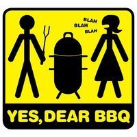
Was screwing around tonight. What do you think?
Last edited:
MattCom
Take a breath!
Was screwing around tonight. What do you think?
It looks very cool, but there's a bit of a disconnect between the dimensional tribal pattern and the flat copy and cross. I'd add dimension to the cross (maybe even enlarge) Have the ellipse where the copy is have some depth and have the copy recessed in the ellipse, so the ellipse looks like a steel plate with copy embossed in. Great style.
just my 2 ¢:clap2:
huminie
is one Smokin' Farker

big matt
is one Smokin' Farker
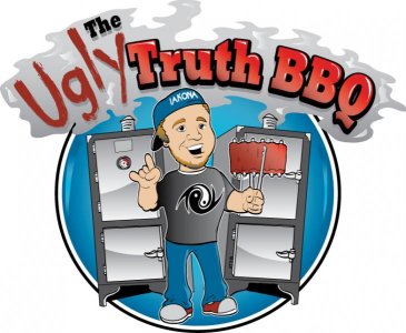
TELL YOU WHAT BBQ
Knows what a fatty is.
mgcolby
MemberGot rid of the matchlight.

Anchors Smokeshop
is one Smokin' Farker
MattG
is Blowin Smoke!
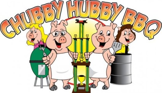
Heres ours

S
Smokenstein & monster crew
Guest
These are all great, Some of these have been incredible, some funny
There are so many different feels to each design, some have attitude, some are perfectly mild, some in your face...great stuff. There so many more out there....
There are so many different feels to each design, some have attitude, some are perfectly mild, some in your face...great stuff. There so many more out there....
MAP
Full Fledged Farker
Big Ugly's BBQ
is one Smokin' Farker
- Joined
- Dec 9, 2004
- Messages
- 42,758
- Reaction score
- 35,621
- Points
- 113
- Location
- Wandering, but not lost
This one is for my son, he is competing for the first time as the Pitmaster in the "pro" division. He doesn't know about this logo, yet.
He probably does now

Very nice! Good luck to him!
biggs98
is one Smokin' Farker
Attachments
Big Ugly's BBQ
is one Smokin' Farker
He probably does now
He has yet to learn the advantages of this forum. But he will........
N8man
Babbling Farker
- Joined
- May 9, 2007
- Messages
- 4,236
- Reaction score
- 8,430
- Points
- 0
- Location
- God's Country Ossipee-Osceola NC
Well, I ain't a competitor, but I have drawd a few BBQ logos....


ROF Texas
Knows what a fatty is.
msavard
Full Fledged Farker
Having multiple graphics professionals on our team has us shying from the traditional cartoon piggy style logos.
Here is our team promo poster for 2011. These were about 2' tall:

Shirt Designs:

Here is our team promo poster for 2011. These were about 2' tall:
Shirt Designs:
Uncle Buds BBQ
is one Smokin' Farker
Here is ours...

pwa
is Blowin Smoke!

Similar threads
- Replies
- 79
- Views
- 7K
- Replies
- 77
- Views
- 6K
- Replies
- 12
- Views
- 1K